
RSMA WEALTH MANAGEMENT
A local boutique wealth manager in search of a more personalized, authentic brand identity and communication strategy.
Rebrand
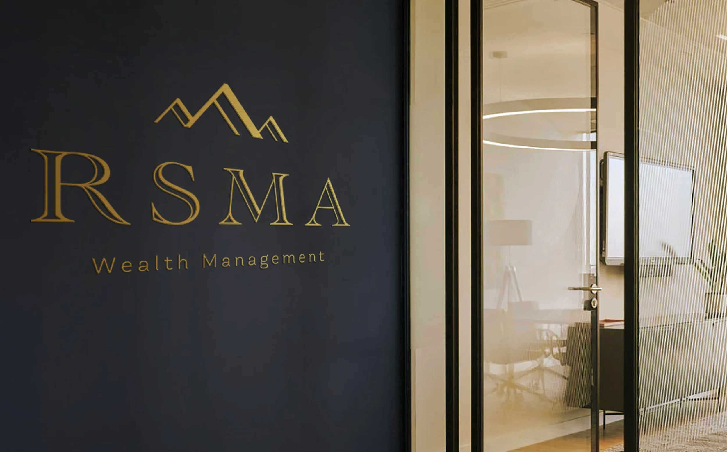
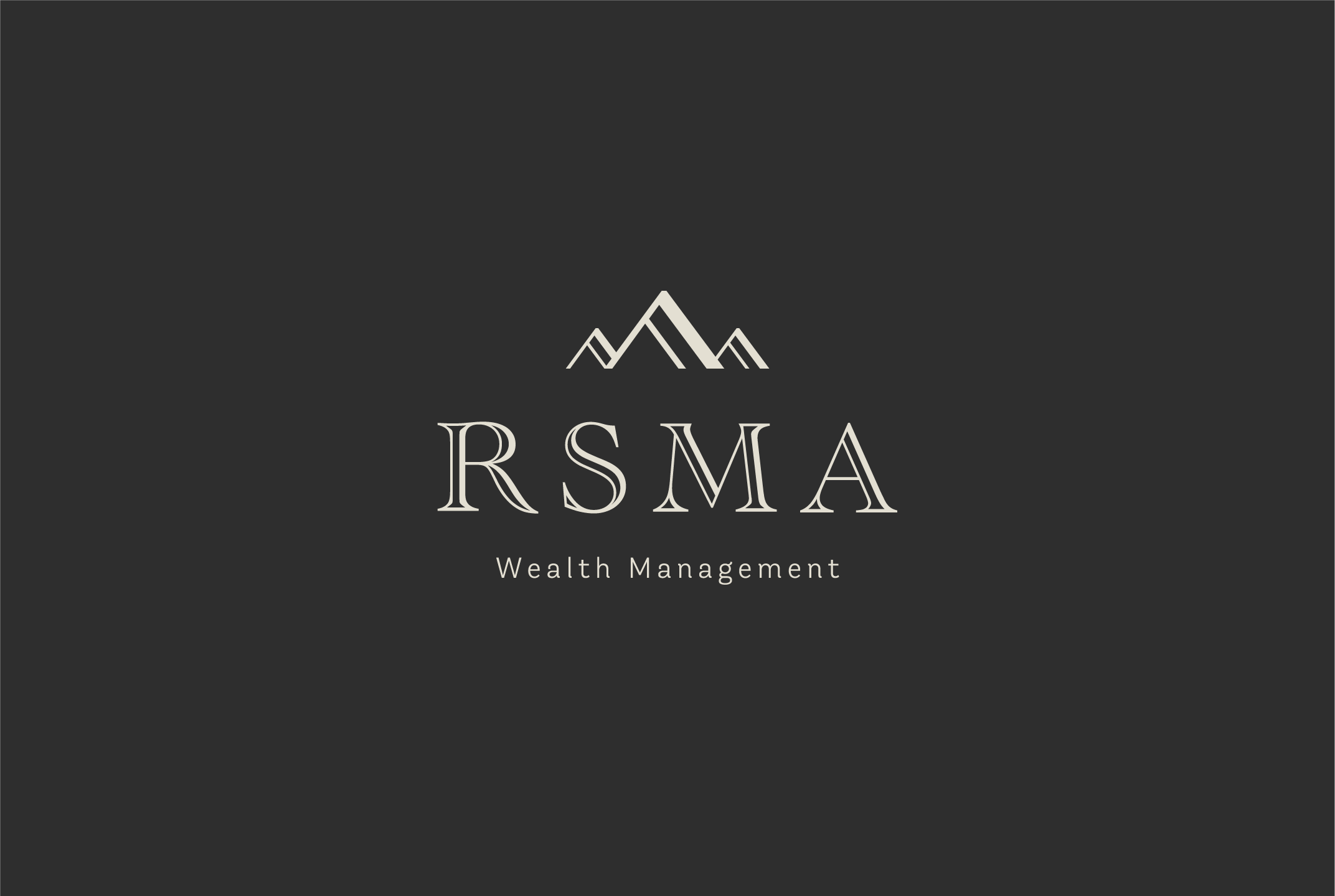
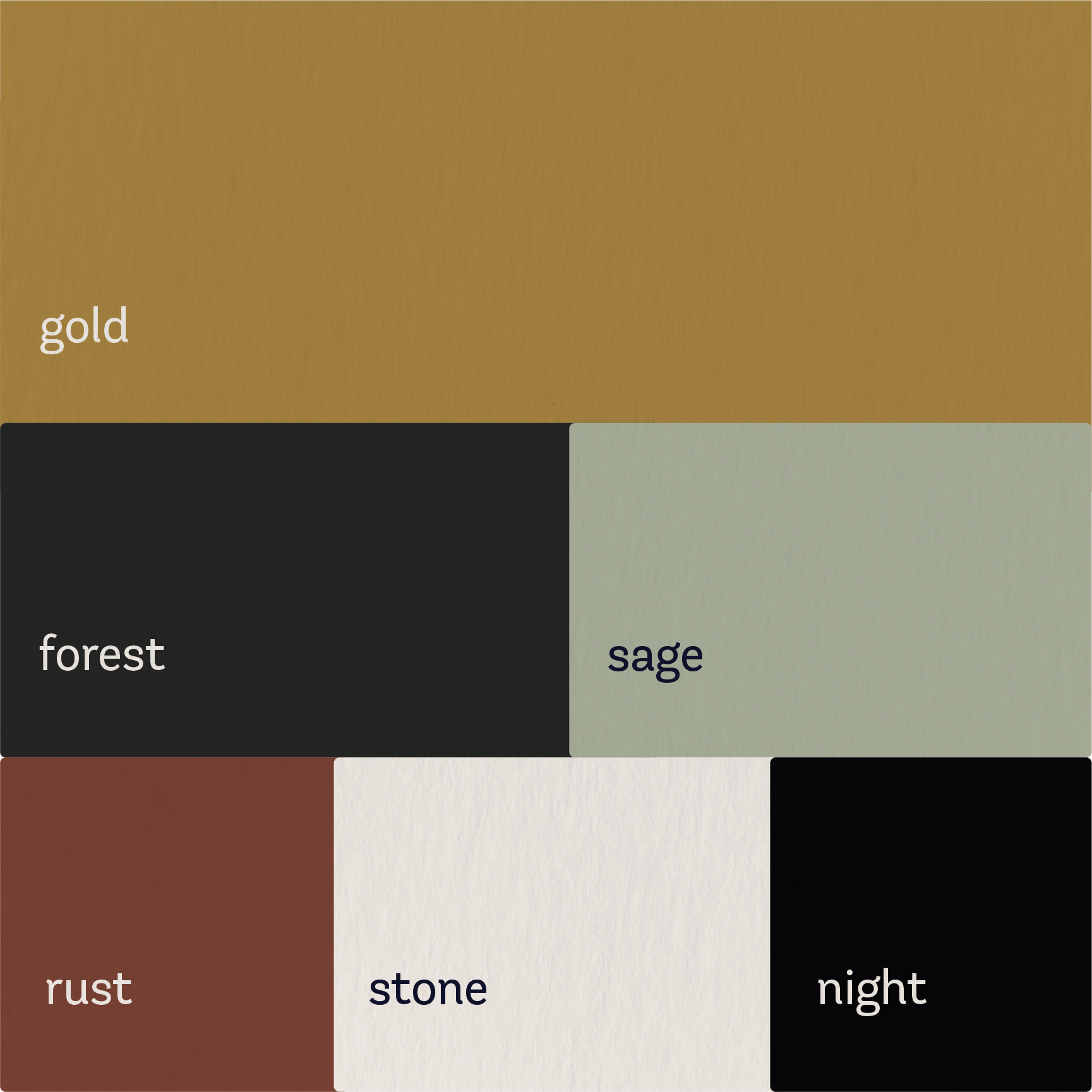
Simplifying the long name down to a more memorable acronym was our first priority. It was also very important to make it clear what service RSMA provided, which made Wealth Management a necessary addition. We then paired the classic letterforms of this traditional Roman typestyle with a strikingly simple and modern sans serif to fully embrace both the professionalism and personalization of the business. Anchored above, a simplistic graphic of mountain tops was added to represent the Pacific Northwest and provide a nod to the previous logo.


Website
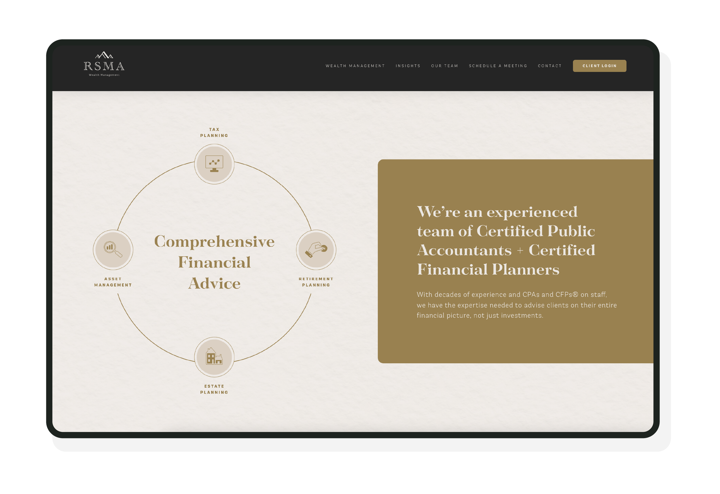
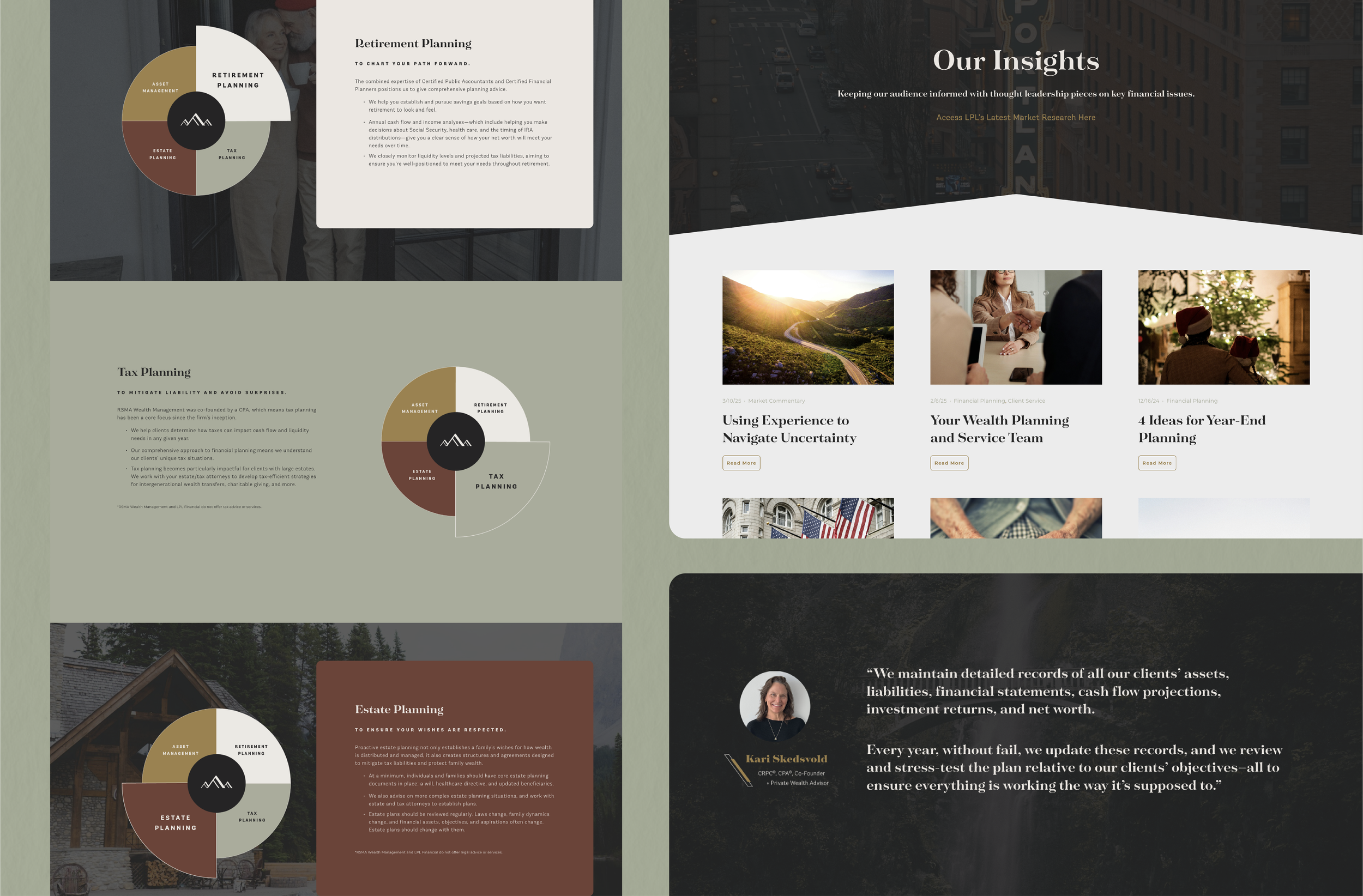
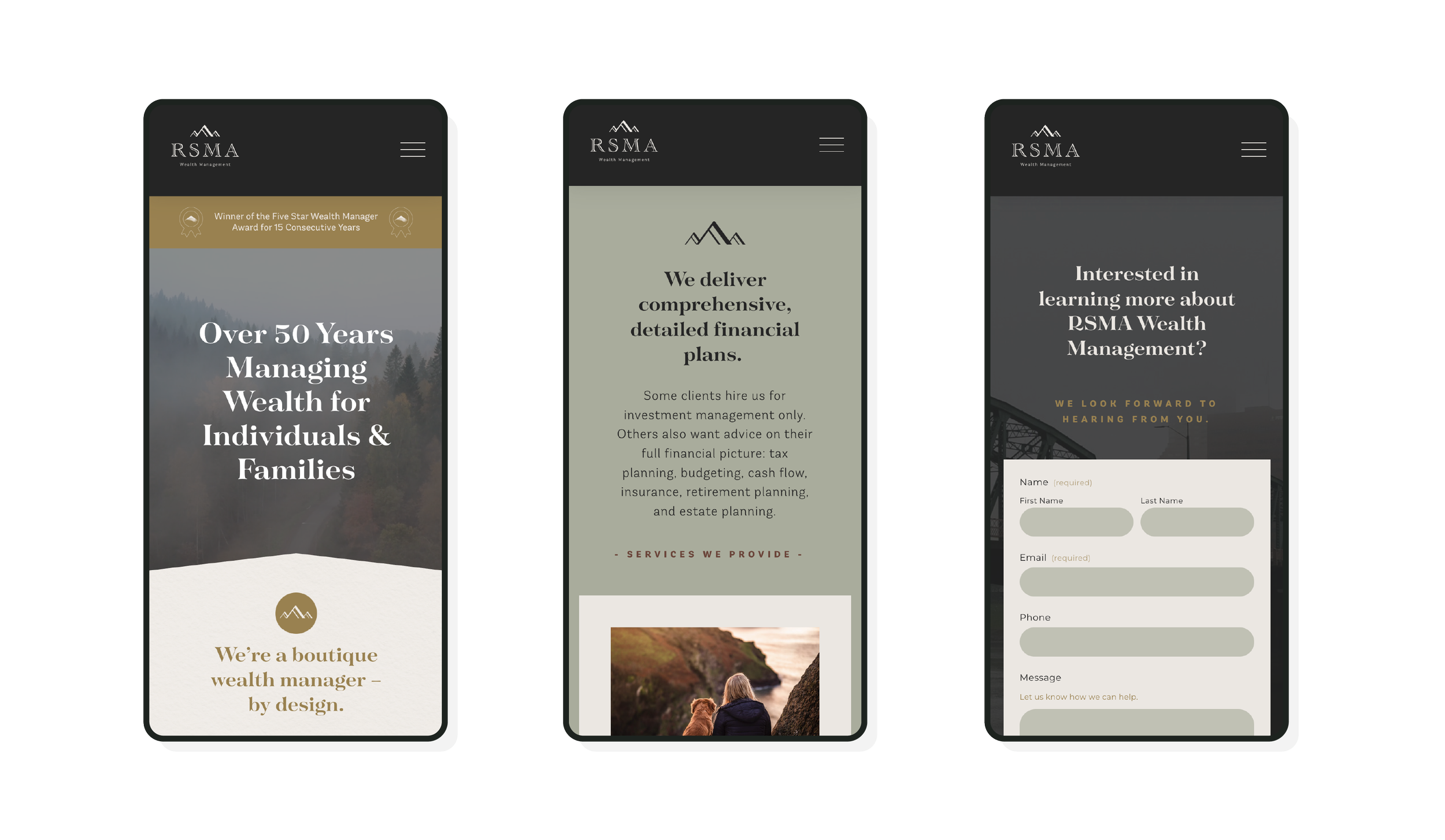
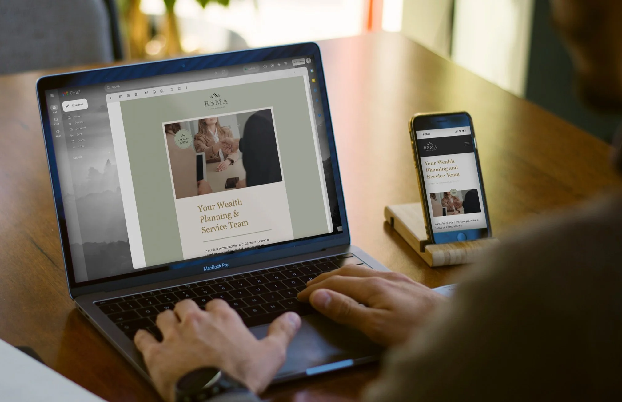
RSMA Wealth Management previously had an off-the-shelf website that relied on vague language and stock photography. While functional, it didn’t reflect the firm’s boutique approach or the depth of expertise their team brings to client relationships.
We designed and developed a new site tailored specifically to RSMA — modern, professional, and aligned with the firm’s brand identity. Custom messaging highlights their CPA and CFP® credentials, while clear navigation showcases their comprehensive planning services. Authentic imagery and thoughtful design replace stock visuals, giving clients and prospects a more personal, trustworthy experience.
The result is a digital presence that communicates precision, professionalism, and RSMA’s commitment to building lasting client relationships.
VISIT SITE
Emails & Newsletters
Before working with Upside Creative, RSMA relied on their parent firm’s communications — research-heavy, generic updates that didn’t reflect RSMA’s boutique approach or speak directly to their clients.
We introduced a fully personalized newsletter program. Each month, we craft original market commentary tailored to RSMA’s audience, design layouts consistent with their brand, and manage the email distribution.
The result is consistent, professional communication that keeps clients informed and engaged, while reinforcing RSMA’s expertise and high-touch service model.
SEE EXAMPLES
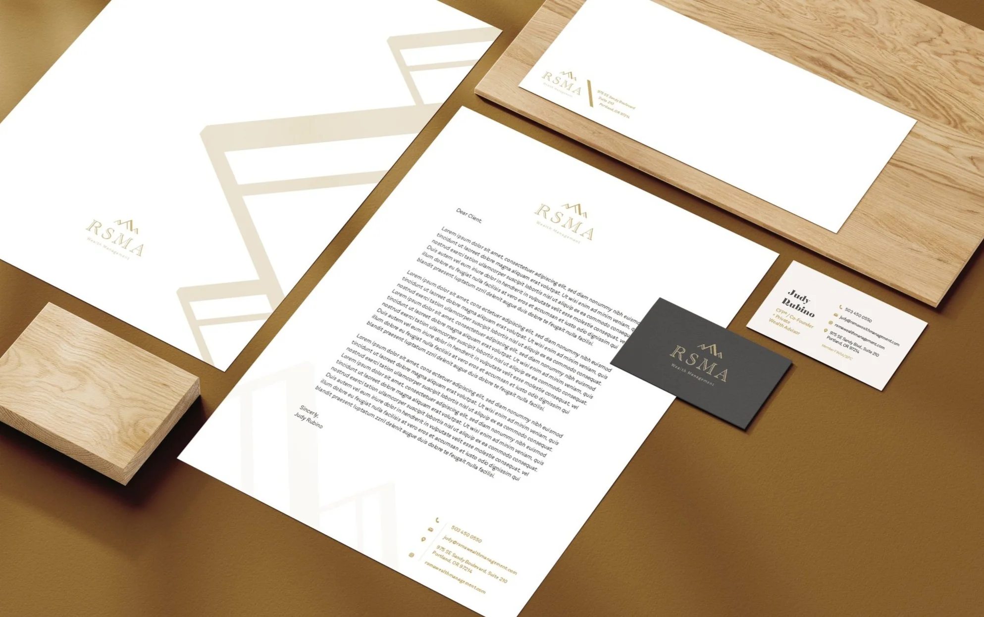
Branded Collateral
We developed a full suite of branded collateral, including business cards, letterhead, envelopes, email signatures, and office signage.
Each piece was designed for consistency and polish, reinforcing RSMA’s identity at every client touchpoint. Whether in person, in print, or online, the brand now communicates the same message: precise, professional, and client-focused.
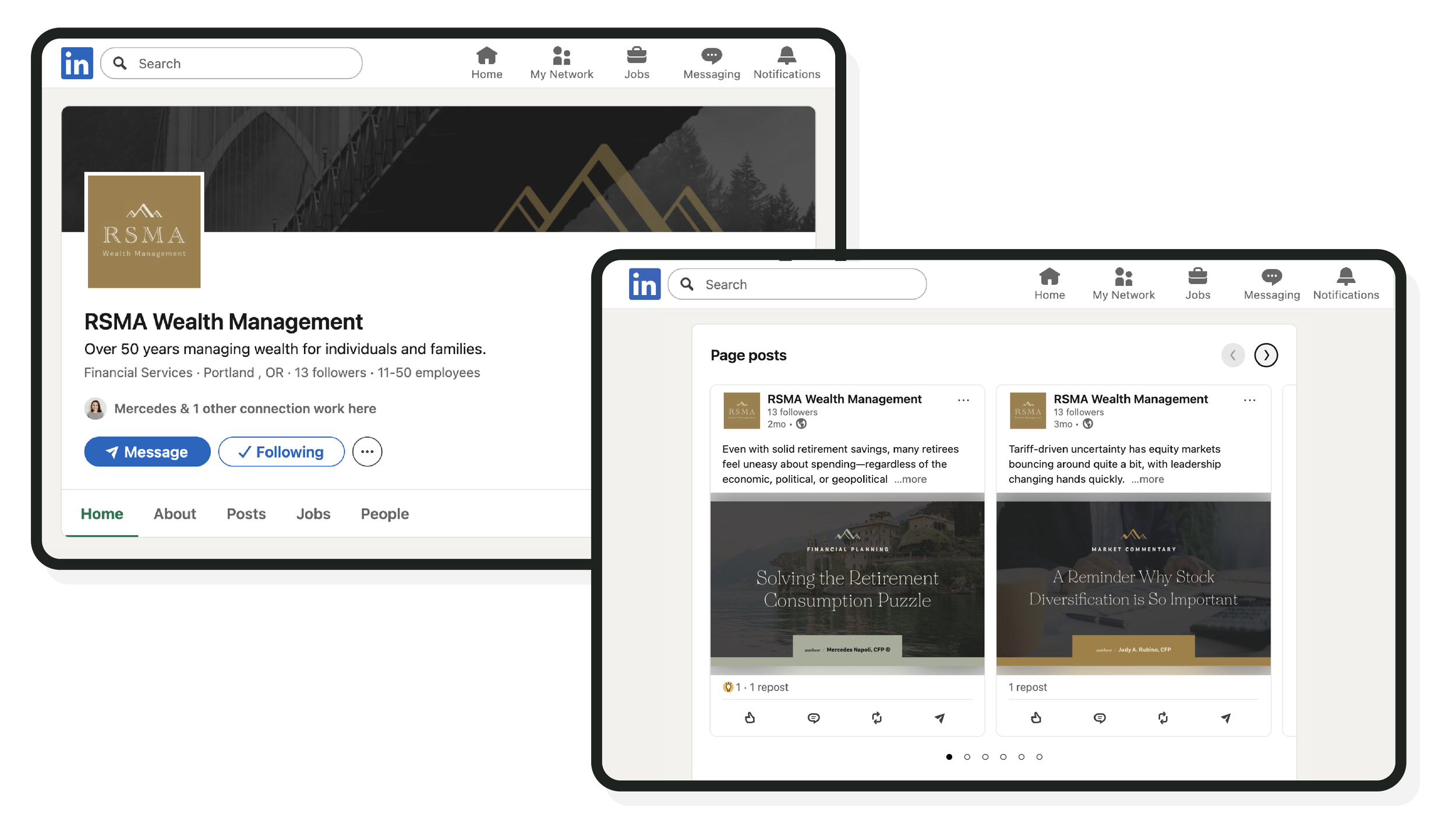
To complement RSMA’s monthly newsletters and investor letters, we manage the firm’s corporate LinkedIn presence — designing custom post imagery, writing thoughtful captions, and linking back to new website content.
Each post reinforces RSMA’s brand identity and expertise, helping them stay top of mind with clients and prospects while consistently demonstrating thought leadership.