WESTEND CAPITAL MANAGEMENT
WestEnd Capital Management partnered with us to elevate their communication strategy. A redesigned website reflects their bold investment philosophy, while a new pitch deck, monthly newsletters, quarterly reviews, and LinkedIn posts keep their audience informed and engaged.
Website Redesign
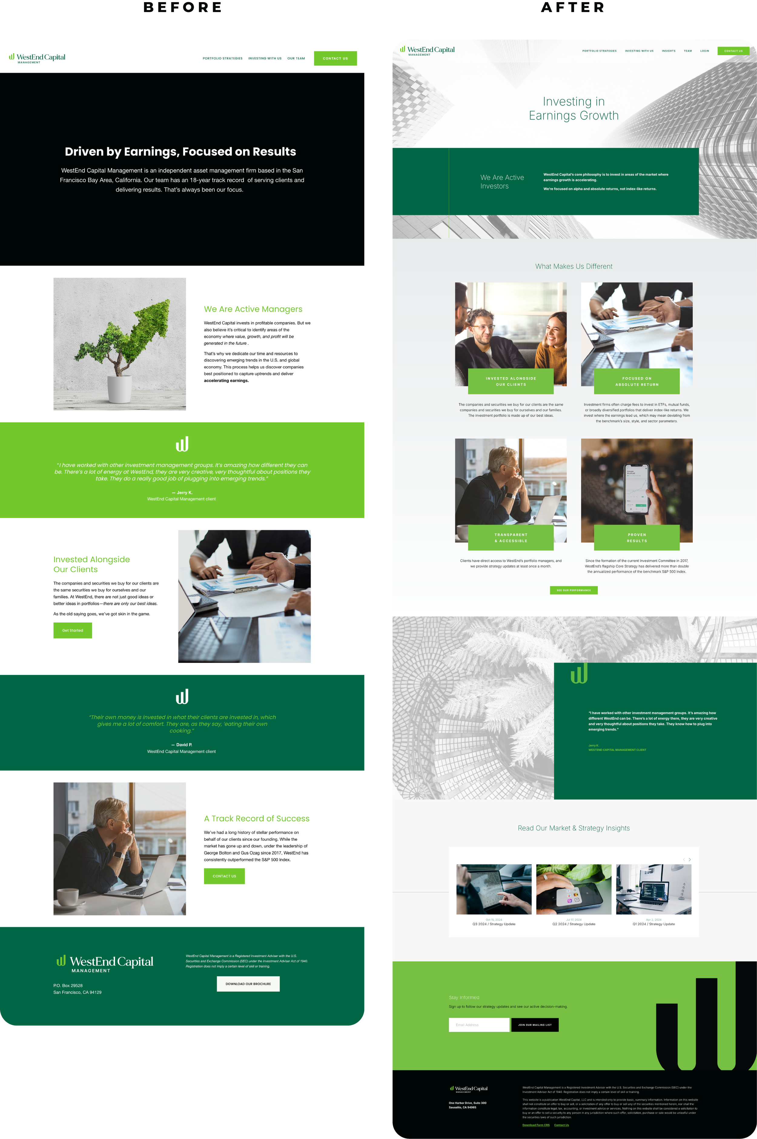
WestEnd Capital’s previous website had the look and feel of a standard advisor template — image blocks, generic copy, and little to differentiate the firm. For a manager with a distinct strategy and strong performance, the site wasn’t telling the right story.
We designed a new site that matches WestEnd’s bold investment philosophy. Clear, direct messaging highlights their focus on accelerating earnings growth and their track record of outperformance. A clean, modern design brings that message forward, while intuitive navigation makes it easy for investors to explore strategies and results.
VISIT SITE
Investor Deck
Before we partnered with WestEnd, their presentation materials were basic and text-heavy, doing little to reflect the firm’s 20+ year track record and strong performance. They needed a client-facing pitch deck that was both visually polished and strategically structured — one that could communicate their investment philosophy and results with the same confidence as their portfolio management.
We rebuilt the deck from the ground up, designing a clear visual system and reorganizing the content for flow and readability. Every slide reinforces WestEnd’s core messages — their active investment process, focus on accelerating earnings, and history of outperformance.
Ongoing Investor Communications
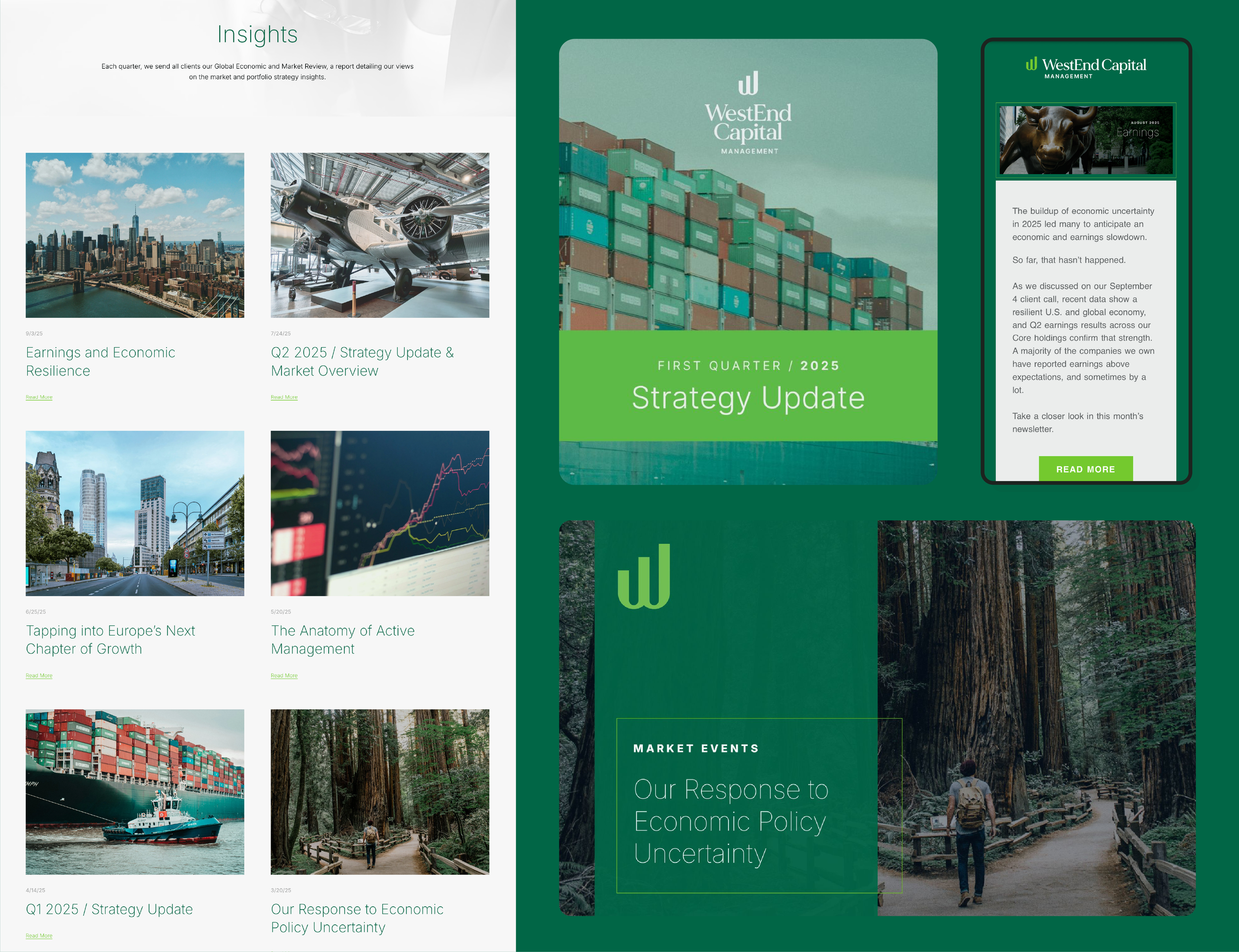
We’ve partnered with WestEnd since 2012 to manage their client communications — ensuring investors stay consistently informed and engaged.
Every month, we produce newsletters that deliver timely strategy updates, written in WestEnd’s voice and presented in a clean, branded design. Each quarter, we create in-depth review PDFs that combine thoughtful commentary with clear visuals. We also handle email distribution and LinkedIn posts, making sure every update looks professional and reaches the right audience.
SEE EXAMPLES
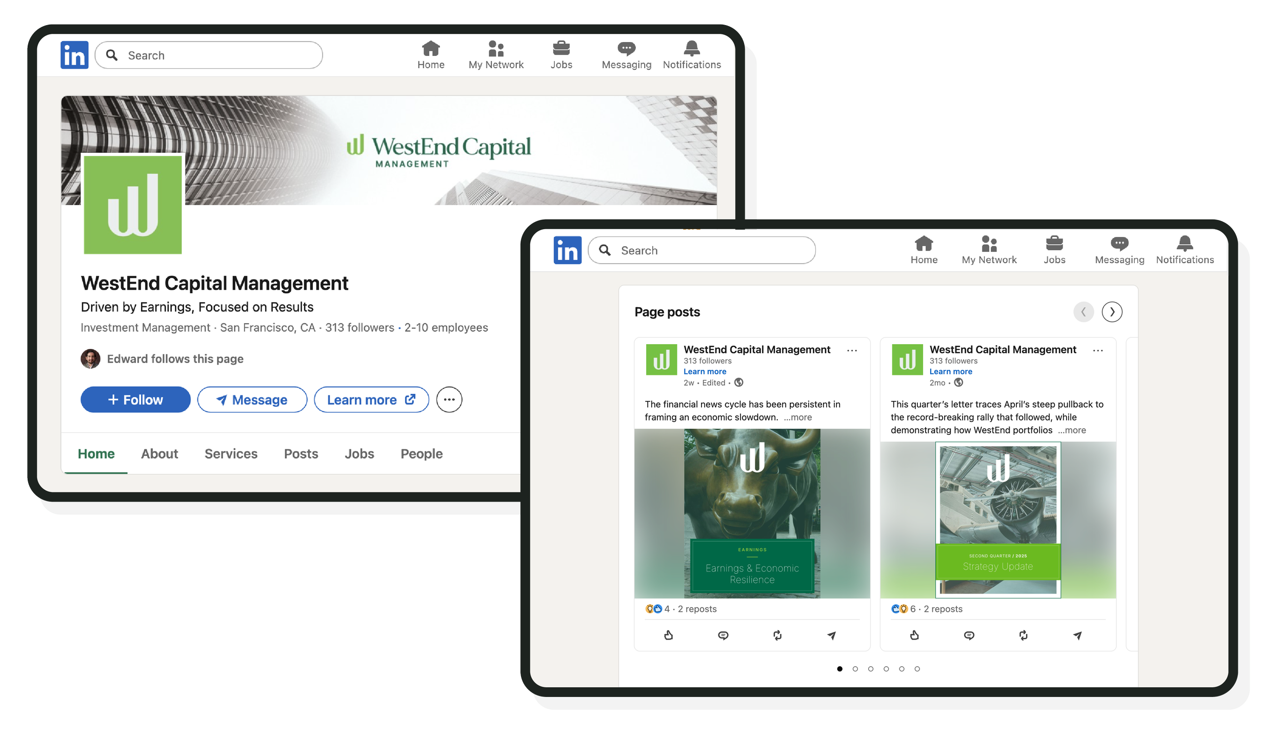
To complement WestEnd’s monthly newsletters and quarterly reviews, we manage the firm’s corporate LinkedIn presence. We design branded post imagery, writing original captions, and linking back to new website and portfolio updates.
Each post is crafted to reflect WestEnd’s active investment philosophy, focusing on portfolio strategy, market positioning, and select trades rather than broad macro commentary.


